COLOR, LIGHT & CLUTTER
The Three Invisible Architects of Space
A well-designed space is not built only through objects or finishes. It is shaped by three silent forces: color, light and clutter.
Each has a role, a rhythm, and a relationship with the other. When one is ignored, the others struggle to shine. But when they work in harmony, the space breathes with balance, clarity, and quiet power.
This is not just about aesthetics. It’s about living intelligently.
1. COLOR – The Quiet Mood of the Room
Color shapes emotion before furniture does. It can uplift or soothe, energize or soften. But color only works when it is supported by spatial clarity and light exposure.
In a cluttered room, color becomes lost. Overwhelmed. It turns from statement to noise. But in a clear, organized space, color becomes: a gesture of identity, a tool of emotional regulation and a connector between function and feeling. The same green can feel healing or chaotic, depending on what surrounds it. The same beige can feel soft or lifeless.
Color needs breathing room. And it needs light.
Color Is Not Decoration. It’s Language.
Color is often treated as a visual accent — a styling decision, a moodboard detail, an afterthought. But in truth, color is a primary architectural material, just as concrete or wood or glass. It doesn’t just influence how a space looks — it shapes how the body responds, how the mind processes, and how the soul feels received.
To speak about color, we must speak about nervous systems, cultural codes, atmospheric intelligence, and the deeper, often unspoken difference between what is trendy and what is true.
In the design world, color trends cycle like fashion. One year it’s sage green. The next, it’s terracotta. Suddenly everything is black kitchens and beige walls. Then the tide turns toward lavender, rust, or bold jewel tones. These cycles are largely driven by market forces: paint companies, furniture brands, influencers, and curated editorial aesthetics. They respond less to emotion and more to commerce. This isn’t necessarily wrong — but it is shallow when compared to the depth color truly holds.
Trends often mistake novelty for truth. They tell people what to want, rather than help them understand what they respond to. A trend might look beautiful in a showroom or a magazine. But in real life — in your kitchen at 7am, in your bedroom at midnight — color behaves very differently.
It reflects light. It absorbs shadow. It whispers to your subconscious. It either supports your system — or it interferes with it.
Designing with Color: Technical Considerations
To use color well, a designer must think beyond the swatch.
1. Natural Light vs. Artificial Light – Colors shift dramatically depending on exposure. A warm beige in daylight may become muddy under LED. A deep navy may flatten out in shadow, or vibrate under halogen. Every color must be tested in-situ, over time, with awareness of the day’s rhythm.
2. Surface Texture – Gloss amplifies color. Matte softens it. Velvet absorbs light. Metal reflects it. Color cannot be separated from material behavior.
3. Surrounding Colors – A “neutral” tone may read green, blue, or yellow depending on adjacent tones. No color is ever absolute — it is always relative.
4. Emotional Saturation – Muted tones soothe. Saturated tones stimulate. High contrast sharpens attention. Low contrast nurtures contemplation. Choosing color is not a matter of taste — it is a matter of emotional regulation.
Color as Atmosphere, Not Object
Color is not a thing. It is a field. It surrounds. It envelops. It changes with time, light, distance, and state of mind.
When applied correctly: it can lengthen a narrow hallway, it can ground an open space, it can create intimacy, remove visual noise, or evoke memory, it can support introversion or host energy, it can heal without ever being named as therapy. This is not about picking a “favorite.” This is about choosing what helps you breathe, focus, or return to yourself in a space.
Color is not separate from you. It is your mood, your ancestry, your education, your longing, your silence. It is the part of design that bypasses the mind and goes straight to the nervous system. So when you choose color, you are not decorating. You are translating your inner world into the environment that holds you. And whether you choose something bold or quiet, familiar or new — you are building a language of support, one tone at a time. Choose consciously.
cause in the end, a space is never just storage. It’s a mirror — of your systems, your storie
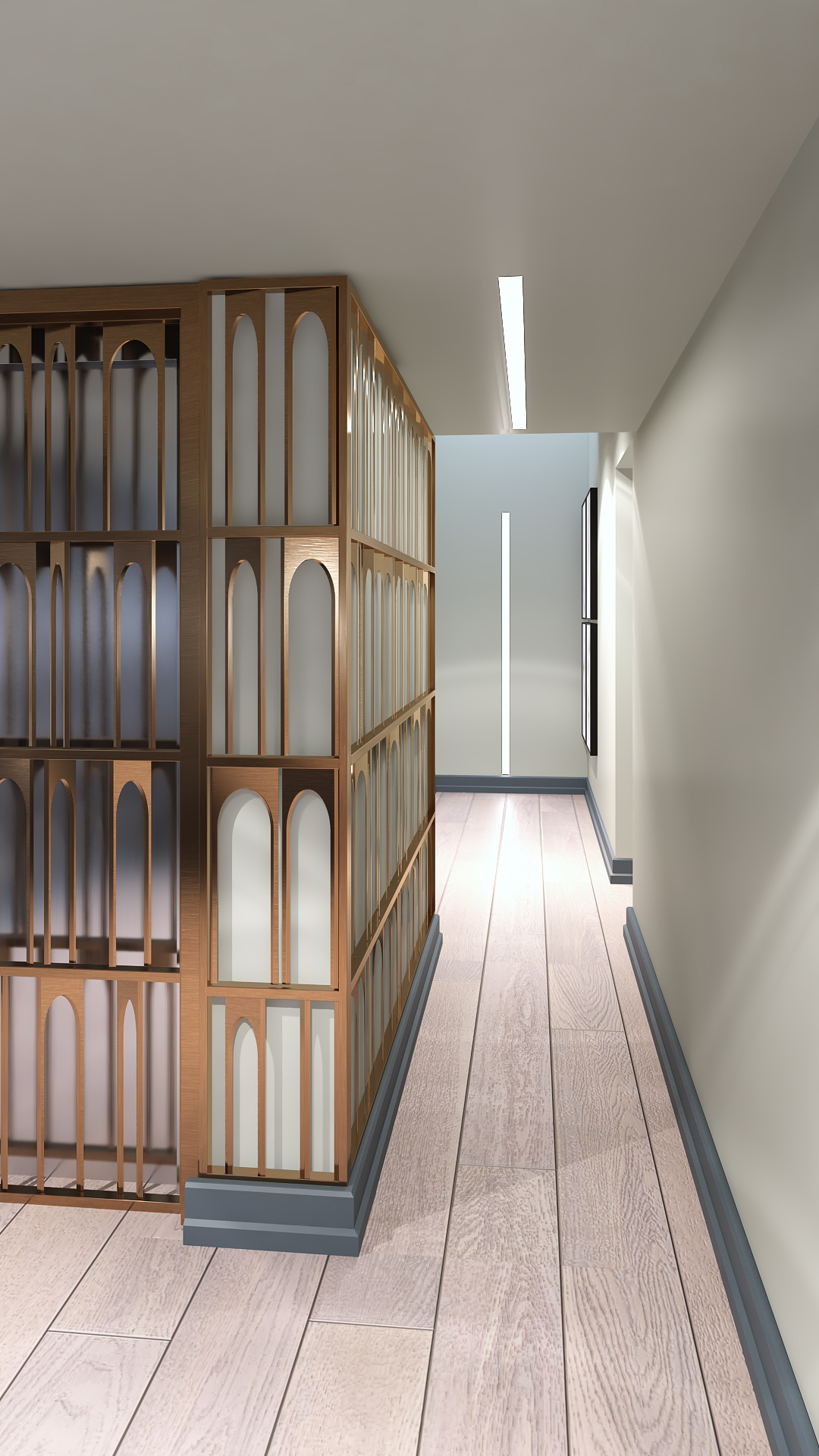
2. LIGHT – The Silent Designer
Light is not an accessory. It is Direction. It is the invisible structure of the room. It shapes mood before color. It defines space before walls.
Light is not what we see. It is how we see. It determines how color is seen. It reflects or absorbs off clutter. It defines height, openness, mood, and flow. It gives rhythm to time, dimension to emotion, and purpose to design. Light doesn’t fill a room — it unfolds it.
In architecture and interior design, light is not a secondary element. It is the invisible structure that holds all others. When used consciously, light can soften a harsh line, elevate a simple material, or give soul to a cold surface. It can silence a space or awaken it.
Natural Light: The Original Architect
Before electricity, light came only from the sky, the sun, the flame. And even now, no artificial source can match the intelligence of daylight.
Natural light creates circadian harmony for the body, changes tone through the day and seasons, adds dimension and honesty to textures and transforms a room without changing a thing. Designers work with light the way sculptors work with stone. We shape the openings. We calculate the angles. We curate the entry of time into space.
Whether it’s soft east light in the morning, the golden tones of late afternoon, or filtered shadows through a sheer curtain — natural light is not static. It’s an active participant in the space. Natural light should be maximized with thoughtful window treatments and spatial planning.
Artificial Light: Precision with Responsibility
When the sun goes down, the space does not die. It must shift with intention. Artificial lighting is not just about brightness. It’s about layering (ambient, task, accent), color temperature (warm vs. cold) – Intensity and dimming control, source placement (overhead, wall-wash, hidden, directional).
Light can make a room feel taller, wider, more intimate, or more ceremonial. But poor lighting can also make even the most beautiful space feel heavy, flat, or disconnected. A good designer doesn’t just “add lamps.” We design the emotional tone of night.
Artificial light should be layered: ambient, task, and accent — each one tuned to the room’s emotional and functional need. A poorly lit room makes even the most beautiful color or clean layout feel off.
Light needs space. Light needs reflection. Light needs absence of visual clutter to perform its magic. Light is not what you add at the end. It is where design begins.
The real art lies in what happens between natural and artificial light. At dusk. At dawn. On cloudy days. In filtered spaces. These moments require sensitivity: soft LED strips that mimic daylight at low intensity, indirect sources hidden in architectural lines, light that respects silence, not disrupts it, lamps and fixtures that are tools of mood, not just shapes in a room. And increasingly, we use adaptive lighting systems that follow the sun’s natural arc, supporting the body’s
internal clock even when the outside world is disconnected.
Tips for Real Living:
Maximize daylight with sheer curtains, light-toned walls, and reflective surfaces
Use dimmers everywhere — control is key
Avoid cool white in personal spaces like bedrooms or living areas
Use more than one source per room — layer the light
Use shadow consciously — not all corners must be lit
Think of light like scent or music — it shapes atmosphere, not just function
3.CLUTTER – The Noise You Don’t Notice
Let’s start with clarity: Clutter does not happen because someone is “messy.”
Clutter is a visible consequence of multiple invisible factors — personal, emotional, spatial, and functional. It often stems from:
- Lack of proper education in spatial organization during formative years
- Emotional accumulation from neglect, instability, or loss
- Environments that don’t adapt to life’s changes
- A mismatch between one’s inner rhythm and the structure of the home
- The modern addiction to impulse consumption without critical evaluation
So no, clutter is not a failure. It’s a response — to a space that doesn’t support the person living in it.
Discipline Is Not Rigidity — It’s Repetition with Care
Good design creates systems. But it is discipline that sustains them.
True minimalism is not visual — it’s structural clarity. It means:
- You know where everything is.
- Everything has a place.
- Nothing takes more time than it should.
- Your environment supports your function — not your fantasy.
This isn’t about asceticism or sterile interiors.
It’s about efficiency, rhythm, and the quiet confidence of space that doesn’t need to scream.
Some universal principles:
- If something hasn’t been used in the last 6–12 months, evaluate its role
- Sentimentality does not require physical storage — memory is not in the object
- Seeing a product on a shelf does not justify purchasing it
- Broken items = unresolved decisions. Repair or release.
- Organize for how you live, not how you wish you lived
Your space should not reflect an imagined self. It should support your actual self, with room to evolve.
Smart storage is not about having more cabinets. It’s about designing systems of discipline — where everything has a place and everything unnecessary is let go. When you remove clutter, you make room for space to speak. You allow the other elements (like color and light) to exist without competition.
Storage is not about hiding. It is about curating your life.
Poor discipline creates emotional and physical drag. Smart storage creates alignment. But neither of these is about personality — they’re about system design.
If your home doesn’t work, don’t start with new furniture. Start with truth.
- What do I need?
- What am I holding onto?
- What am I avoiding?
- What do I no longer owe?
Then design from that place. Because in the end, a space is never just storage. It’s a mirror — of your systems, your storie
THE TRINITY: WHEN ALL THREE ALIGN
When clutter is removed, light flows. When light flows, color lives. When color lives, the space becomes emotionally aligned with the human inside it.
Each one depends on the others:
- Color without light is dull.
- Light with clutter becomes blocked.
- Clean space without color or light becomes cold.
Together, they form the invisible skeleton of any good design. And at the center of that skeleton is one word: discipline.
Discipline Is the Designer You Don’t See
Discipline is what ensures: that storage is intentional, that items are curated, not hoarded, that colors are chosen, not accumulated and that light is honored, not ignored. Discipline doesn’t mean minimalism. It means awareness. And awareness is what allows the room to become clear, steady, and supportive — no matter the style.
A beautiful space is not just built. It is allowed. When you manage your clutter, choose your colors, and welcome light with intention, you don’t just design a room. You design a state of being. And that is what truly lasts.
written by Amalia Predescu
copyright@DekoreStudio