Design as Emotional Architecture
Understanding Needs, Wants, and Expectations Through Form
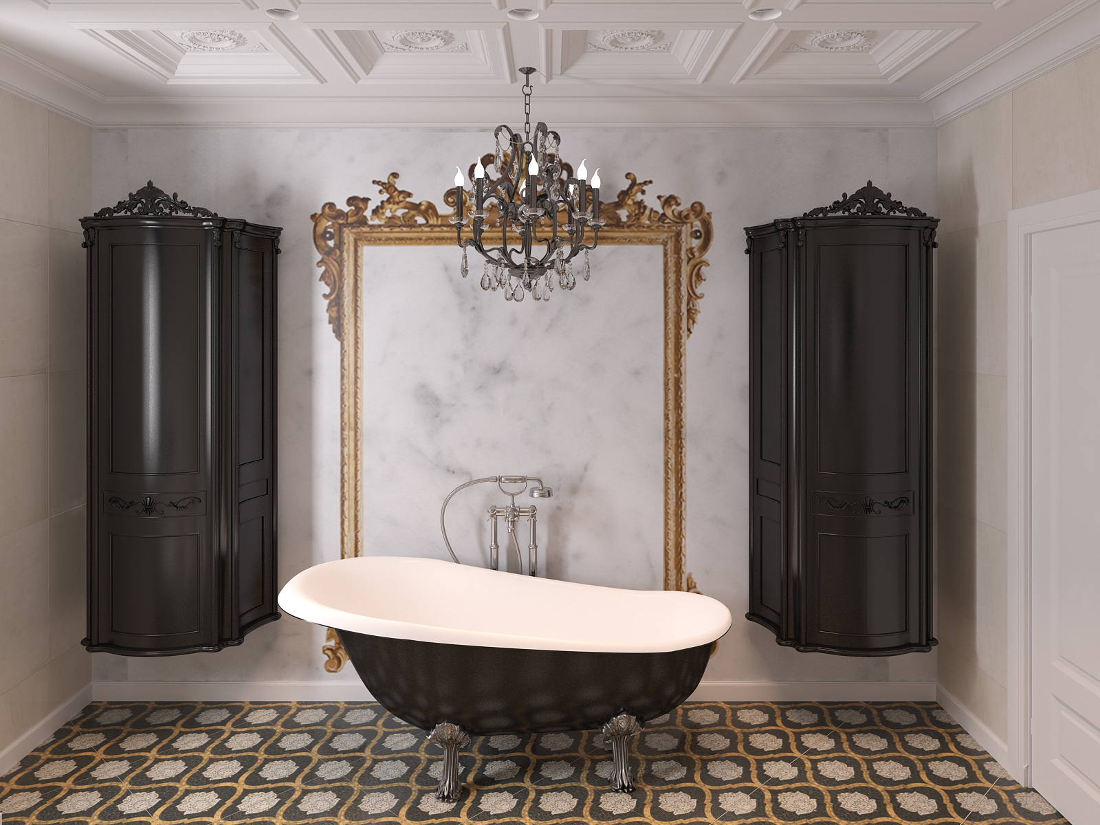
Design is Not Just Function. It’s Structure for the Invisible.
We often speak about design in terms of materials, shapes, and aesthetics. But the deeper, more refined view is this:
Design is the physical expression of unseen architecture.
Of tension. Of memory. Of rhythm. Of pressure. It is the system through which emotions are given body — not just abstractly, but quite literally, in form, structure, and space.Every curve, every void, every color choice — reflects an internal geometry. The architecture of your needs. The weight of your expectations. The friction between your wants and your limitations.
This is what I call emotional architecture. And it is the quiet foundation beneath every decision in a space — whether we see it or not.
Emotions Are Not Soft. They Are Structural.
We often associate emotion with something fluid, subjective, or invisible. But emotion has form. Emotion becomes matter.
And that matter organizes itself in:
- Lines (straight for control, curved for softness, asymmetrical for complexity)
- Volumes (tight spaces for containment, openness for relief)
- Textures (raw for honesty, polished for protection)
- Colors (vibrancy for extroversion, neutrals for regulation, contrast for clarity)
- Material choices (stone for grounding, metal for discipline, wood for warmth)
These are not surface preferences — they are sensory blueprints encoded by each individual’s emotional system.
Cosmic Architecture, Earth Forms, and the Origins of Emotion
Before design became interior, it was cosmic. The alignment of stars. The spiral of galaxies. The flow of rivers. The sediment layers of stone.
All these forms existed before language — but shaped how humans eventually felt and built.Emotion does not arise in a vacuum. It is a response to form. The body recognizes proportion, scale, symmetry, and texture long before the mind knows what to call them. That is why sacred spaces across time — from temples to mosques to caves — share common geometry. Because cosmic forms regulate emotional systems.
Design today is no different. We crave curves not because of trend, but because we evolved inside wombs and valleys. We resist sterile minimalism not because it lacks beauty, but because it lacks pattern familiarity — the kind our nervous systems use to locate comfort.
So when we speak of emotional architecture, we’re not talking about moods. We are talking about the ancient intelligence of space — and how our bodies still carry the memory of form.
The Human Senses: Translators Between Emotion and Form
Senses are not accessories. They are instruments. They measure rhythm, temperature, resistance, pressure, transparency, light.
They translate external design into internal states.
- Sight detects shape, color, scale — organizing safety or alertness
- Touch interprets edges, heat, softness — translating threat or trust
- Sound maps openness, absorption, silence — echoing calm or stimulation
- Smell anchors memory and identity — tying space to time
- Proprioception (body awareness) reads spatial layout — guiding movement and orientation
Every sensory input shapes how a person feels in a space — and therefore how they behave in it. So when I design, I don’t just consider what will be seen — I consider what will be sensed. Because the space is not a stage. It is a nervous system for the people who enter it.
Color and the Nervous System: The Psychological Layer
Before you even know it, color speaks to your entire sensory system.
- Red increases blood pressure and evokes urgency, sexuality, hunger, or passion.
- Blue lowers tension and supports calm, distance, or mental focus.
- Green restores equilibrium, mimicking nature’s balance and regeneration.
- Yellow stimulates attention, optimism, and anxiety in equal measure.
- Black anchors. It defines edges and identity, but in excess, can create compression.
- White opens. It gives clarity, but when sterile, can feel cold or exposed.
- Brown and Earth Tones create stability, ancestral memory, and safety.
These effects are not merely cultural — they are biological responses, developed over thousands of years of evolution and interaction with nature.
To ignore this is to design blindly.Color Memory and Cultural Imprints
But biology is not the whole picture. Color also carries cultural, historical, and educational weight.
For example:
- In Western culture, white suggests purity or simplicity.
In some Eastern cultures, it symbolizes mourning.- Purple may signify luxury in one region, spiritual humility in another.
- Bright colors can read as joyful, playful, or unsophisticated, depending on context and class associations.
Clients often believe they have personal preferences — but those “likes” are built from decades of societal imprinting. Fashion, childhood environment, education, and even media exposure all inform how color is emotionally decoded.
A designer must read these invisible codes with fluency — knowing not just what a client says they like, but what their body language and spatial habits reveal they actually need.
Education, Culture, and Social Status as Emotional Coders
No one chooses design from a neutral place. Every preference is filtered through:
- Cultural associations (what is seen as “elegant,” “humble,” or “warm”)
- Educational exposure (who taught you what good taste is)
- Socioeconomic imprint (what materials or finishes are associated with dignity, aspiration, or success)
A person who grew up with scarcity may equate luxury with abundance — more layers, more shine, more presence. A person raised in academic or artistic environments may value restraint — matte finishes, intellectual symmetry, visual quiet. All of it is valid. All of it is emotion wrapped in context. And no matter how modern the project, those embedded emotional codes shape the final layout.
The Emotional Blueprint: Needs, Wants, and Expectations
Every client brings to a project their emotional architecture. Some express it clearly. Others don’t have the language — but the signs are there:
- Needs shape function (What must be present to feel stable?)
- Wants shape identity (What must be present to feel like me?)
- Expectations shape rhythm (What must be present to match who I think I should be?)
When these three align, design becomes effortless. When they conflict, the space begins to reveal the tension.
A person may want light, airy openness — but fear exposure. They may need order — but crave softness. They may expect elegance — but carry unresolved chaos. As a designer, my task is not just to execute preference. It is to decode these layers — and then reflect them back through physical space.
What You Choose Is Who You Are Becoming
Most people think they “like” certain colors or “prefer” certain layouts. But preference is only the surface.
Underneath, design reveals a silent map — of memory, identity, and intention.
It shows:
- What you need to regulate yourself
- What you want the world to see
- What you’re still trying to resolve
Every room tells that story. Every color, texture, alignment — even the empty corners — are expressions of your current inner structure.
So when you choose a design — whether impulsively or through deep planning — you are always creating a space that mirrors your emotional geometry. You are building a shell that fits the shape of your inner atmosphere.
Emotional Architecture Is Not Optional. It’s Inevitable.
Whether you’re conscious of it or not, your emotions shape the spaces around you. And those spaces, in turn, shape how you feel, behave, and relate to the world.
So design is not a luxury. It is not an accessory. It is not a decoration.
Design is the built extension of emotional structure. And every choice you make — whether bold or subtle — is your way of shaping how you want to live, relate, and evolve.
Once you understand this, design becomes not just beautiful — but alive. And your space stops being a project. It becomes a mirror. A companion. A map of where you’ve been — and where you’re ready to go next.
In a world overwhelmed by information, color, movement, and clutter, there is one design language that speaks not loudly, but truthfully: Zen. So to better understand design as emotional architecture it is most obvious to reference the culture of ZEN.
ZEN – The Discipline of Simplicity in Architecture and Design
why Zen design has become a powerful global language for intelligent living
Less Noise. More Being.
Rooted in centuries of Eastern philosophy and aesthetics, Zen design has found its way into modern homes and hearts across the globe. Why? Because Zen doesn’t ask for attention—it invites stillness. It doesn’t add noise; it removes it. In a time when we’re all seeking more clarity, more peace, more space to breathe, Zen offers a quiet return to what truly matters.
Why the World is Turning to Zen
Western design—especially in its Victorian or classical forms—has often celebrated abundance: ornamental detailing, layered textures, dramatic color palettes. Even modern styles, though more minimal, still focus on bold statements and sharp contrast.
Zen offers the opposite. It focuses on presence, space, light, and balance. It teaches us to live with less, but to feel more. It replaces busy aesthetics with intentional silence. Where other styles often express identity, Zen invites you to lose the noise of identity and reconnect with essence.
This is why so many people today are drawn to Zen: because they are exhausted by environments that overstimulate and undernourish.
Core Elements of Zen Design
Natural Materials
Zen design is rooted in what is real and alive. You’ll often find: warm woods like cedar, ash, or bamboo; raw stone, handmade clay, or earth plasters; natural textiles like linen, cotton, and wool; rice paper screens and organic woven textures. These materials age gracefully, and more importantly, they breathe. They allow the space to evolve with you.Color as Atmosphere
The Zen palette is muted and grounded: warm greys, beiges, off-whites; deep greens, soft browns, charcoal; occasional use of natural indigo or rust tones. These colors don’t demand attention—they support emotional regulation and sensory balance.Space and Light
Room height and layout matter. Zen spaces often feature: lower furniture, open floor plans with clearly defined emotional zones, screens or natural dividers instead of walls, natural light as the main source of illumination. This creates a rhythm between openness and intimacy.Shapes and Forms
Zen design uses simple, grounded forms: low, wide surfaces, rectilinear shapes with softened edges, forms that invite stillness, not reaction. There are no unnecessary curves. Everything has a reason.Texture Instead of Ornament
Zen avoids cluttered decoration. Instead, it relies on: the grain of wood, the softness of fabric & the coolness of stone. Texture becomes the aesthetic. It invites you to slow down and feel.Plants and Water
Plants are not decor—they are living, chosen presences. Often just one or two, carefully placed. A single bonsai or bamboo stalk. Moss in a quiet corner. A water feature with soft movement or sound These elements create emotional balance and reconnect us to nature.Zen is not expensive. It is disciplined. You can begin small:
- Declutter surfaces with honesty
- Replace synthetics with natural materials
- Paint with soft, neutral tones
- Invest in quality light, not quantity
- Add one plant, not many
- Use low furniture to shift the visual field
Minimalism in Zen isn’t about less stuff. It’s about more clarity.
Zen Compared to Other Styles like victorian (heavy, ornamental, and rich in visual stimulation) or modern (sleek, functional but often focused on visual impact), Zen is quiet, grounded, and emotionally sustainable. Zen offers something different: a felt sense of calm. Not because it’s plain, but because it is intentional. Every object earns its place. Every wall has air to breathe. Every detail is designed to disappear into presence.
Discipline, Not Decoration
Zen design is not about aesthetics alone. It’s about living with clarity. It teaches us that discipline is not rigid—it’s liberating. That silence is not emptiness—it’s room for being. And that “less” is not a sacrifice—it’s a doorway to more peace.
Design your space the way you wish to live: present, clear, and rooted in what truly supports you. Because in the end, smart living is not about how much you own. It’s about how much you no longer need.
written by Amalia Predescu
copyright@DekoreStudio